Conservatives cannot design
Right-wing assholes can tell you everything you never wanted to know about intelligence… yet cannot typeset an apostrophe

My affectionate sobriquet for you kids is “right-wing assholes.” Call yourself a member of the alt‑, dissident. or new right; non‑ or anti-progressive; or simply conservative. I will respect your pronouns no matter how you identify. But all of you operate under an iron law: Conservatives cannot design.
This means you.
A conservative is someone who pretends not to understand plain language even while accusing liberals of denying reality
What I will explain here can be expressed compactly, though you will duly claim not to understand me:
You are not illiterate, but you have no knowledge of or abilities in typography and copy-editing (“type and copy”).
Your skills max out at typing, perhaps not with ten fingers, into text boxes in browsers.
When typing on computer, the only characters you are capable of rendering are those imprinted on your keyboards.
You’re too young to have read masses of professionally edited copy, which, in recursive fashion, you in turn could not recognize, let alone learn from or emulate.
The right wing pretends to hew to tradition, but rejects craft, not least excellence in same.
These cofactors have left you unable to produce good type and copy, and furiously resistant even to the contention that levels of quality exist or are achievable.
You are the competency crisis
Of course there’s been a gradual, then sudden, decline in societal standards. But you aren’t exempt from that decay just because you know a man can’t get pregnant. The difference? You merrily set out blogging and Tweeting (and, Lord help us all, publishing journals and books) with no self-awareness that your skills aren’t up to the task.
Your half-assed first-order guesses at how to set type are almost always wrong. You are incapable of taking correction and you will not tolerate the word “no.”
To use a comparison you Americans will understand, when it comes to type and copy you’re all Shaniqua at the DMV.
How this make u feel?
Terminology
You’ve been visually poisoned by Word for Windows and by blogging templates, which date back to the warblogger era of TypePad and Blogspot. Unbeknownst even to yourself, you think every passage of body copy can and must consist of rectilinear paragraph masses separated by a blank line.
Here we face the intractable conundrum of design criticism: In practice, the only designs you can talk about are those that are reducible to thumbnail size. Good luck doing a copy-edit on a JPEG.
As such:
“It’s graphic design when it’s this far away”
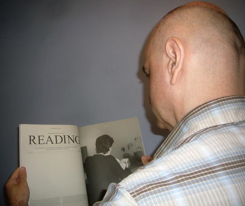
“It’s typography when it’s this far away”
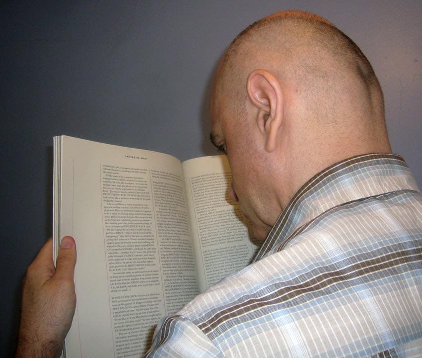
“It’s typesetting when it’s this close”
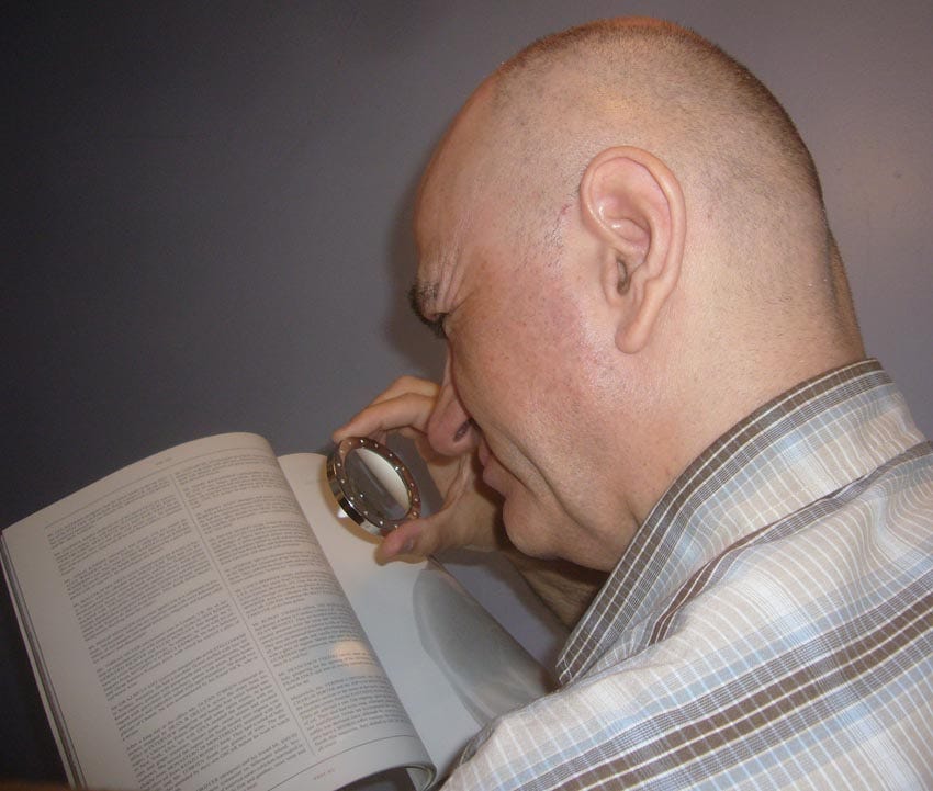
Display type is big and is used for headlines and callouts. Body type, or body copy, is text you are meant to read at length.
In the Web-design context, viewing a page at differing levels of analysis, or just of magnification, leads to the common offence of masses of unreadable off-grey text. Graphic designers are actually nearly illiterate – I won’t say dyslexic because dyslexia, as popularly conceived, is phonological, not graphemic – and are as flustered by pages of text as a young autist is by a nearby car alarm.
Nobody is less visual than a conservative
Conservatives are idea people or word people. You don’t think in images. You aren’t visual people.
As an example, no one to whom I have presented the work of Tin Bro can begin to comprehend it, let alone appreciate it. This now-dormant “anon” account reimagined the æsthetics of Hergé’s Tintin. (Of course “anonymous” now also means “pseudonymous.”) Nobody, at all, whom I have polled can even explain what is going on in these illustrations.

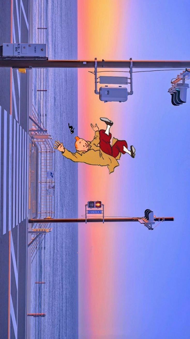
(You also cannot pronounce “Hergé.”)
Progressives deny that beauty exists. Conservatives deny that variations matter. Your cohort further denies that it is even possible to communicate visually. All you can imagine is communicating with words, which, as expressions of ideas, have no form. Conservatives are great at talk radio, YouTube, and podcasts – speech, not writing.
Form, or format, of words cannot matter.
Even the simplest design methods, like laying out a page on a grid, can’t be explained to conservatives who like everything else in their lives boxed neatly inside boundary lines.
‘70s rock ‘n’ roll:
Everything pivots on the apostrophe
Now, you guys like to accuse each other of being spiritual liberals or spiritual faggots. Even if you just bought a nice new MacBook Pro on the instal(l)ment plan, spiritually you’re all Windoids.
I know people at Microsoft Typography and I know their Ph.D. reading researcher. I’ve done paid work for the former through a contractor. These are very solid people technically, to the point that it was basically impossible to typeset Tibetan on anything but Windows for 20-odd years, a limitation you surely butted up against on many an occasion.
But the Windows user, while made in God’s image, is a lower form of life. They’re terrified of their machines, perhaps rightly, and are incapable of learning. They also manifest the unearned princely arrogance of a minority at a Democrat-slush-fund NGO.
Are you really any better?
The Windows attitude toward typography is “It doesn’t exist, it’s not important, and I’m really good at it.”
A Windows user cannot render an apostrophe. Spoiler: The key between semicolon and
Returnon an American keyboard does not produce one.And here let’s define the term render in the context of type and copy. To render text means to use correct underlying characters (you’ve probably heard of Unicode) with correct features one or more levels above mere character correctness.
As an example, jot down by hand the true name of the author of this book.
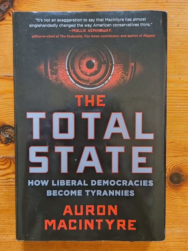
CENTRED CAPS: the last refuge of the scoundrel. (Confidential to AURON MACINTYRE [perverse official orthography]: theater-kid-occupied government is rendered thus in your dialect.)
Text rendering can involve invisible characters (optional hyphen); visible but non-printing characters (nonbreaking space; thin space); diacritics; invariant case (“MACINTYRE”); and suprasegmental text effects like italics. A word can contain all of those and more. Just a part of a word, even below the level of the morpheme, can contain those features. (“I said Mac Donald, with a space.” “Sorry, Heather.”)
In text where markup is possible (as in HTML), correct semantic elements must be used. (A top-level headline is H1, not BIG BOLD.) In word processing and desktop publishing, character‑ and paragraph-level styles are essential.
You guys are right-wing. You would not dispute the assertion that a man who cannot tie a Windsor knot is barely more than a boy. If you cannot render an apostrophe correctly 100% of the time in all contexts, you’re even more of a retard than that. Get it wrong – in any of three ways, the worst of which is misrendering an opening single quotation mark in its place – and you’ve given the game away.
The complication here is that it actually is tricky to type an apostrophe on Windows. But Macintosh keystrokes for opening and closing single and double quotation marks have been unchanged for 40 years, and you can bang them out at full speed. Call this punctuation curly quotes if you want, but if you cannot type them on Macintosh, you aren’t gonna make it. (Apostrophe and single close quote are the same character, for better or worse and despite Unicode alternat[iv]es.)
Shoephones and pads let you type real quotes by pressing and holding the neutral-quote key. No excuse there, either.
The only Windows users who manage correct typography are former Macintosh users who had to laboriously research and re-learn correct methods on the inferior platform they suddenly find themselves saddled with.
You aren’t postmodern novelists and you are not crafting ironically ugly layouts
If you guys had any institutional knowledge, you’d counter-argue that Craigslist was the most successful site on the Web for years. (You probably shouldn’t try to claim that Google was “undesigned,” since I know the designer who quit in disgust and the developer who improved its homepage HTML.) Craigslist used barely-modified browser defaults and was ugly as sin. But it “worked.”
The problem here is I was in the room when Craig Newmark was presented with a candidate redesign that preserved much of the feel of Craigslist but sanded off the sharp edges. All Craig did was shrug.
Nor are any of you pushing the boundaries of text or literature. You’re constitutionally incapable of pushing a boundary. I did a first-pass copy-edit of Thomas777’s Greatest Poasts, for heaven’s sake. (He can’t set an apostrophe, either.) I’m one of the few defenders of Lawrence Braithwaite, a dead gay Jewish mulatto from Quebec (“Now you have two problems”), and his fucked-up prose. You, sir, are no Kathy Acker.
A new land to plunder: print
Not content with ruining electronic copy, now right-wing parvenus despoil the ancient landscape of print.
Lomez (perverse official orthography: L0m3z) arrogated for himself the right to publish the most error-prone right-winger on Earth, Steve Sailer. Nobody produces worse type and copy than “Sailor” does, and I have told him so. He’s the ne plus ultra of smart men who cannot even spot their own typo‘s.
Update (2025·02·08): Classic Steev. (Also note apostrophe.)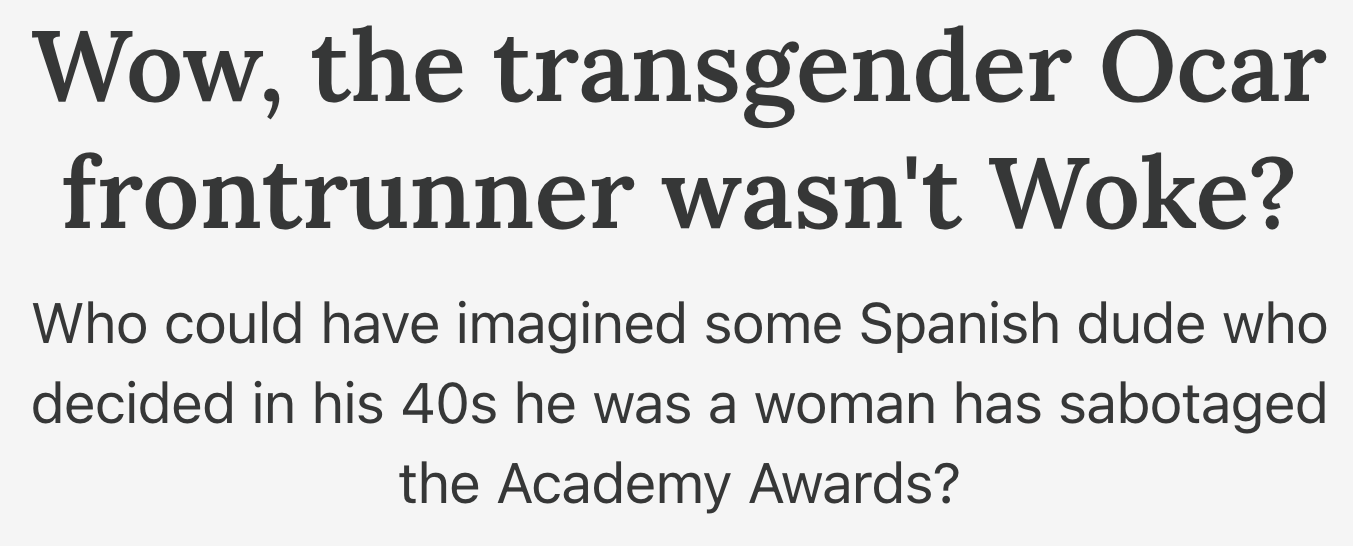
Camp of the Saints is being republished by a small outfit, Vauban Books. There is no hope of doing this correctly without retypesetting from scratch.
The same applies to Obergruppenführer Charles Haywood’s project to republish Theodore Judson’s books, chiefly Fitzpatrick’s War. I have twice offered to help. (At least Vauban is listening to me.)
One reason you guys never managed to budge the needle an inch until Trumpenreich 2.0 is the plain fact that all you do is blog and tweet. Not an original observation here, but: Before they bought a castle, what precisely had VDare accomplished? Nothing. Just like you fellas. (Except Lord Brimelow got himself steamroll[er]ed by Shaniqua at the DMV.)
So you’re doing it all over again, now in print. Always fighting the last Iraq War, right-wing assholes have missed the cultural moment in which underground magazines could influence culture. You, sir, are not publishing Butt (or its successor, Fantastic Man, pictured above).
Raw Egg Nationalist cannot manage to put bookmarks and page links in his PDFs even after I pointed out said lacunæ and offered to fix them. Nor, it seems, can he manage to keep a shirt on.
And, coming in just under the wire, a day or so before publication here, the Egg issued his latest tome, which indeed managed to render quotation marks thus:
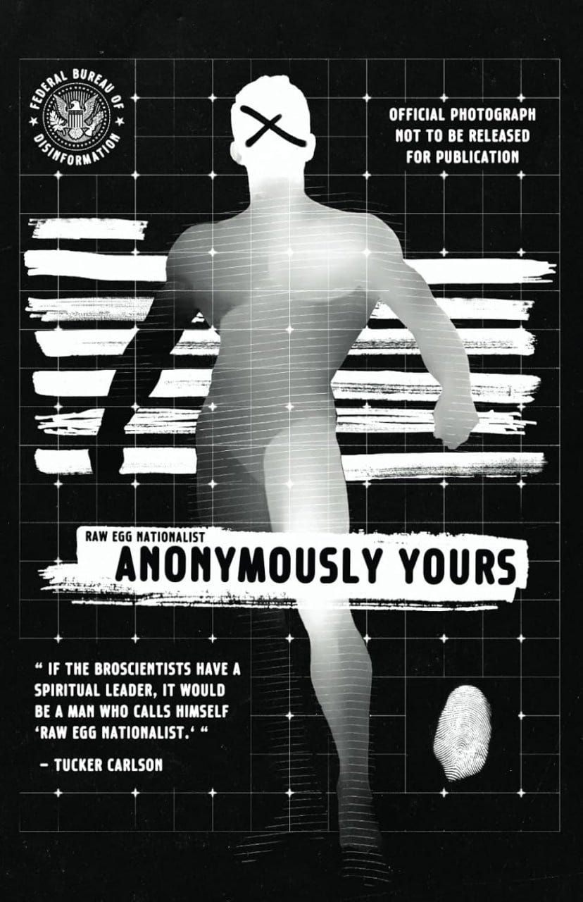
“ IF THE BROSCIENTISTS HAVE A
SPIRITUAL LEADER, IT WOULD
BE A MAN WHO CALLS HIMSELF
‘RAW EGG NATIONALIST.‘ “
Not even its editor can name the third character in the title of the journal that can be read aloud as “Eye Em Seventeen One-Six.” Ask him about it and he’ll block you.
Not a single journeyman publisher has ever paid money to license a legitimately designed typeface, and it shows.
Wait till they find out that entire centuries of fonts simply are unreadable when printed out via Amazon KDP.
Isaac Simpson: mischling and cautionary tale
“Fucking Jew underminer” Isaac Simpson is a worst-case scenario of interloping arriviste.
I fell for this shyster’s malarkey and foolishly tried to help him. (“I will teach you everything I know. But you have to want to learn at least some of it.… I’m not going to charge you for anything at any time. The issue here is getting you to take type and copy seriously.” “im not understanding what you’re offering” [sic].)
I explained that his personal Web site had to serve as a repository for all his articles, and offered to upgrade said articles to valid HTML. (I am the last person alive who can manage that.)
I tried to edit his ad copy. Worse, assessing the only prominent design he has ever produced, a speculative poster for Charles Haywood’s Foundationalism.

Here he couldn’t even get the linebreaks right. I tried to explain how the whole layout lent itself to the sui generis Antique Olive typeface family, not least the epically named Antique Olive Nord.

I laboured to explain to this aficionado of Mad Men – many such cases – that the true antecedent of televisual treatment of advertising was Thirtysomething. (I handwrote a 300-page episode guide for it.) Simpson won’t be bothered to buy and repeatedly load vintage DVDs, or just watch on YouTube.
Of course he blew the word-initial apostrophe in the song title “Texas Hold ’Em.”
Lacking all of a prepuce and half a clue, Simpson dug in his heels on a folk etymology of chino (as in pantalon; note case) as corruption of “China.”
I suggested two books easily bought for near pennies, Stop Stealing Sheep and Branding with Type, only to be told “im not reading any type books[.] this is why i hire designers” (“...with whom you be unable to have any kind of detailed discussion”).
Isaac Simpson has no actual work product to show us, or at best a nugatory gamut thereof. He insinuated his way into your demimonde by appearing on grandees’ podcasts or inviting them onto his. Like, Simpson managed that despite like being one of the most dysfluent speakers in right-wing podcasting. Moon Unit Zappa was more of an oratrix back dans la journée.
Simpson insists he is the boss in his little agency, Will (perverse official orthography: WILL), but has no standing to order anyone around given that his (typo)graphic knowledge is less than nugatory.
Worst of all, as I wrote him, “[h]ere we have a Jew lecturing a Catholic about the nature of God.”


Simpson burned bridges with the only man on earth who could help him, who had offered to do so over and over again.
Men, don’t let this happen to you.
Editors
To be fair to Simpson, which I am not predisposed to be, writer and editor are separate roles. Copy-editor is yet again separate. It is a commonplace that famous writers are bad spellers. Who can forget Miss Jan Wong, in her “Lunch With” column in the Globe and Mail, stumping Peggy Atwood with “macaroni”?
(And before I go on, I trust you read Simpson’s piece “Total Editor Death”? “Some of the new autist dissidents don’t like editors... but historically almost all great writers not only had editors but editors famous for editing other famous writers.... The slop we see bursting out of every pour is a result of indecisiveness,” he writes, failing to spot the errant homonym or the self-contradiction of the whole enterprise.)
Yet you cruel young conservatives go full Dunning–Kruger by failing to realize you even need an editor. Or if you do, you hire one of your kinsmen, who is as much of a retard as you are. The blind leading the naked, if you will forgive the reference.
I have done everything I can to offer aid and succour to non-progressive publishers. (I also sent along months of copy-edits to an antifa blog back in the day. Its writer was later doxxed – to no ill effect.)
If you don’t like my attitude, well, I don’t like your incompetence. (In which direction does the cause-and-effect arrow point there?) If you hazard a guess that there are any number of similarly qualified editors who can even remotely stomach your ideas, let alone (copy‑)edit, mark up, and typeset them, behold your army of one.
Are you keen to hire a graphic designer? They’re all shitlibs, and yes, in the present day they’re untutored and subliterate. A case can be made that a registered graphic designer has required competencies, but those exist in one place on earth – Ontario. They’re all shitlibs too.
Crybullies
Again because I’ve been at this longer than so many of you have been alive, I understand the psychology of the amateur publisher.
Redolent of the midwit and of the wounded narcissist, now that I’ve pulled back the curtain on a huge list of topics you never knew existed, instead of learning something, or deciding to embark on learning something, or just letting me improve your type and copy all you will do instead is fume, act offended, and shitpost.
(Old Sovereign Publishing, whatever that is: “It must have really bugged [you] that you took the time to write to us about it.”)
You’re no good at type and copy. You will fight tooth and nail against this attestable fact, and will choose to seethe with performative resentment rather than improve your skills. In that respect you’ll be no better than a leftard.
To paraphrase Michael Malice, who also repeatedly refused my help, yet later had to reissue a book due to its errors: Some people are better than other people. As I told Vox Day that time (this was well before he indirectly lost a million-plus bucks of donor money), you’ve achieved publishing without typography.
Build back better, you Nazis.
Why are there no links in this article?
Because you are not reading its canonical version, another term of art with which any publisher needs to be au courant.
I am providing this Substack variant because all you right-wing assholes scroll through are Twitter and Substack, though I deny you actually read the articles at the latter. (Substack: The natural home of unreadable masses of grey text – now with unconstrained use of lexemes like “faggot” and “retard.” Some things barely change. Nor does Substack have any notion of a canonical URL – no fewer than three have been provided to me for this poast.)
I have gone easy on illustrations in this article, saving them up for a rogues’ gallery elsewhere. (Or, as you might misrender it, rogue’s, rogue's, rogue‘s, rogue`s, rogues', rogues‘, rogues`... or rogues.)
Cheers for the book recs feller. Comfy article
This expose was revealing. I appreciate someone who knows their craft pays attention to detail, and perhaps most importantly, puts a premium on maintaining the long and storied TRADITION of typesetting.
You would think right wing men would put more stock into things like creating quality print work with proper goddamn copy-editing and typesetting.
The dismissive responses demonstrated by both Keeperman and Simpson are pretty disappointing. Especially given the businesses they’re in.
Must be frustrating to offer to help them correct these problems for free and then get blown off.